Typography based logos (also known as wordmarks or logotypes) have been used to brand some of the most iconic companies in the world, but people still comment on the simplicity of such logos, often using the words "I could have done that myself!"
If that were true, why do people spend extensive amounts of money to hire professional designers to create type-based logos?
The answer is simple—good typography is nowhere near as simple as it may seem. It is often said that good design is invisible, and this certainly holds true here. When a type based logo is well-designed, it may seem deceptively simple, but a lot of effort has gone into making it look that way. Only when it is badly designed would a customer notice that something was wrong.
Here are a few things the logo designer may have spent their time and expertise on:
Choice of typeface
The choice of typeface itself is based on an extensive research process. The designer needs to fully understand the brand, its core identity, and its audience. The typeface needs to convey the values and essence of the company in a subtle, memorable manner. The tone that it conveys must align with the tone of the brand, so that customers can quickly make a link between the logo and the product or service being offered.
Different types of fonts convey different meanings, and within each category there are so many options to choose from. A wedding planner's brand would feature a friendly, flowy handwritten font that represents the emotional nature of the business; whereas a financial institution's brand would need a more traditional, corporate font that conveys reliability and security. The typeface itself should be treated as a visual in terms of what it can represent.
Licensing & budgets
Designers also need to consider font licensing and costs if the client has a particular budget in mind. I've previously written about why using free fonts found online is a definite no.
Competitor audit
A competitor audit is necessary before starting the design process, to avoid using the same font or colour palette as any close competitors, to prevent any confusion in the minds of customers. The designer should work towards making the brand stand out in the busy landscape of the industry.
Custom typefaces
Given a more sizeable budget and timeline, a company could also work with a type foundry or lettering artist to create a custom, one-of-a-kind font for their brand, like Coca Cola.
Adjusting kerning
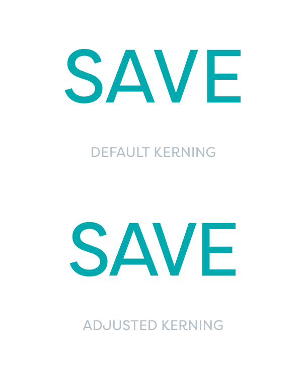
Kerning refers to adjusting the space between letters. Fonts come with a default kerning, which works fine for most everyday purposes. However, designers often need to manually adjust this spacing for a properly refined design, because not all letter combinations behave the same. For example, when the letters "AV" are placed together, they look very far apart compared to other letters around them.
The eye is instantly drawn to the gaps in the letters if they are not adjusted, so the designer should be tweaking these details for a visually pleasing result.
Typeface tweaks
Even when using an existing typeface, designers may adjust some details to make the logo work better, such as the size of some curves/lines within the letters, or joining letters together.
Including subtle details
Some type based logos include a subtle graphic message, such as the popular FedEx logo, which has an arrow hidden between the "E" and the "x". Using negative space can be a clever way to include a symbol without explicitly creating a graphic separate from the type. An actual arrow on top of the logo would have seemed very literal, whereas hiding it within the lettering gives the logo a more subtle, sophisticated and memorable effect.
Colour palette
Some of the best known brands in the world are remembered simply by their brand colour, from McDonalds to Tiffany & Co. The choice of colour used in a typography based logo helps convey the personality of the brand and becomes recognisable. Given that the designer is working purely with typeface and colour to represent the entire brand, it is important to get these right.


